How to make a pivot table
Intro
Redash’s pivot table visualization can aggregate records from a query result into a new tabular display. It’s similar to PIVOT or GROUP BY statements in SQL. But the visualization is configured with drag-and-drop fields instead of SQL code.
Step 1: Write a query
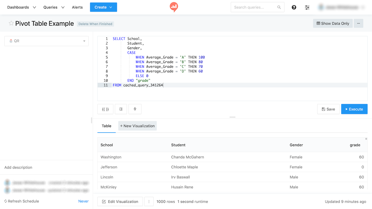
It should return at least three columns. The source query for a pivot table is usually non-aggregated or “melted”. In the below example, I pull indicative data from a school grading system. This is mock data.

The SQL query is “dumb”. It doesn’t group or sort the data. Because we’ll use the pivot table to do this without SQL.
Save the query.
Step 2: Add a Pivot Table visualization
Click New Visualization and choose Pivot Table as the visualization type. The visualization preview on the right will update to show a pivot table.
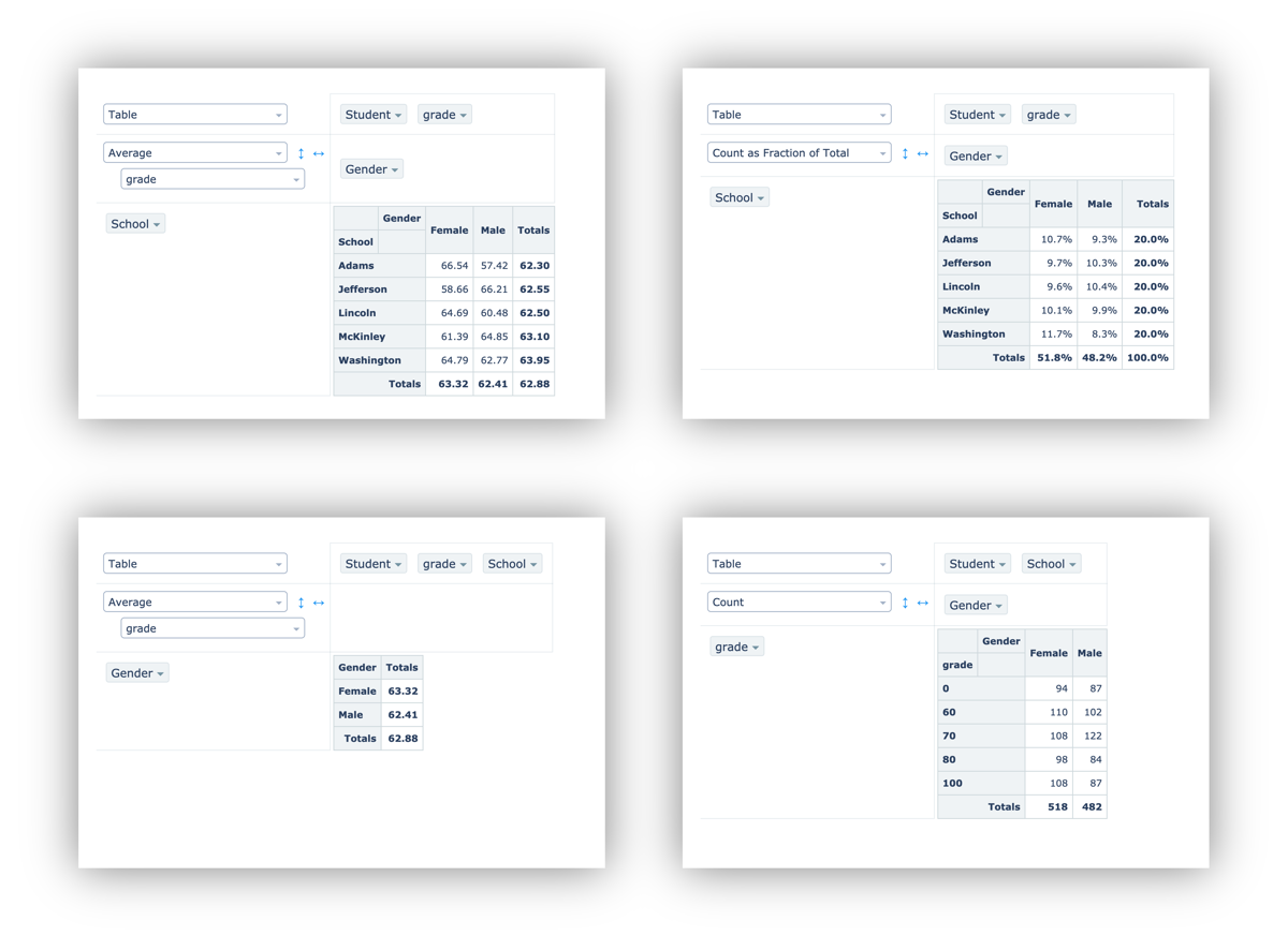
All the field aliases from your query result become available at the top of the pivot control surface. You can drag these to the row side or the column side. You can also nest them.
Here are some examples using the grade data above:

Pivot table performance can degrade if your query result is too big. The exact size threshold will depend on the computer and browser from which you access Redash. But in general, performance is best below 50,000 fields. That could mean 10,000 records with 5 fields each. Or 1,000 records with 50 fields each.